a while back i started playing with the historical public data for home mortgages. the data goes back to 1990, and i wanted to try to see what patterns it tells. the short is that the charts rendered here are just the tip of the ice berg, and represent a very small portion of what is to come. suffice it to say that the US mortgage landscape is very interesting, very dynamic and tells many stories. for the time being, here are two small stories.
the data, home mortgage disclosure act data, has been collected more or less with the same elements since 1990. a row in this database is a mortgage application. the volume of rows, without any filters, shows the number of applications for mortgages (originated, denied, or sold etc) in the US per year. it represents not a complete census, but generally speaking the most comprehensive assessment of mortgages annually in this country.
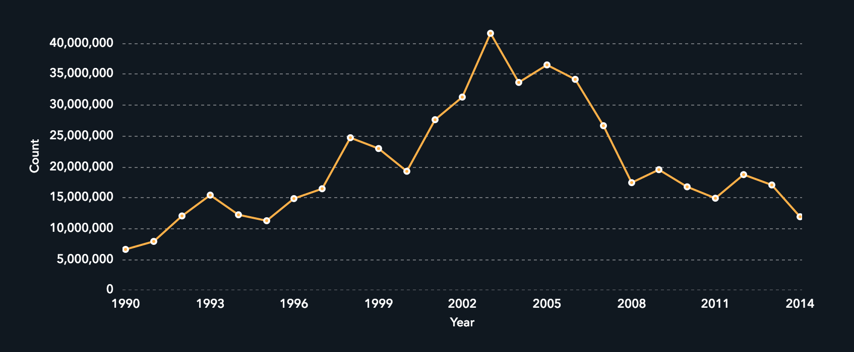
in chart 1 we see the count of all applications nationwide. the raw data for this chart can be found here (after all, i am an open data guy), and was assembled from the national archives. the time series shows a dramatic a-frame curve coincident with the now well documented mortgage crisis/great recession.
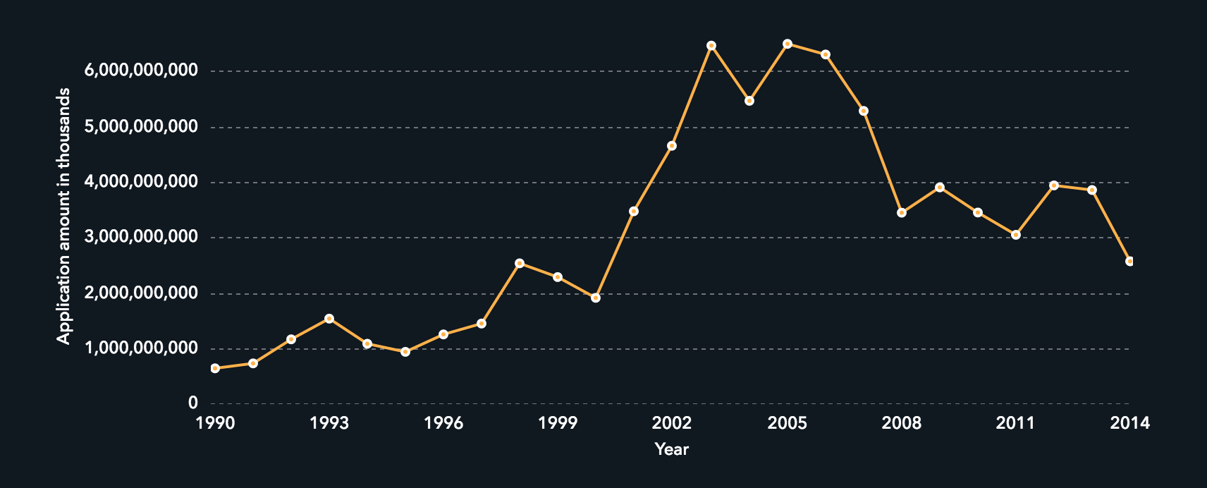
in chart 2 we see the total application amount in $1,000s of all applications in chart 1. the dramatic rise to $6.4 trillion in total application amounts in the years 2003-2005 followed by the dramatic fall to $2.5 trillion in 2014 underscores the perceived wealth gained, and real wealth lost in the us. interestingly, several recent articles in the washington post highlight some inequities in wealth lost/gained by geography.
i plan to expand on some of these thoughts slowly over time. tweet me at @bynre_tweets with comments.
February 16, 2025
the biggest disaster in our lifefimte
September 24, 2019
in reflecting, no single thing could possibly capture what i felt in '89 or after this weekend, but for me i gathered a handful of themes.
September 24, 2019
government is the best place to work. the people are amazing and i have never met any their equal. i am proud to have had a service career.
October 02, 2018
government is the best place to work. the people are amazing and i have never met any their equal. i am proud to have had a service career.
March 24, 2018
Changing the federal acquisition regulation would require an inordinately large shift, likely an Administrative Procedures Act rulemaking or perhaps even legislation, both of which are very unlikely scenarios.
December 04, 2017
i hope that there is a slim chance my children can experience some mountains or canyons, without handrails.
February 18, 2016
tonight i have remembered the night it shook my bones. i just wanted to write about it for its own sake.
April 15, 2015
it is the opportunity to reflect that everyday activities are the most important thing. it is a milestone that the kid got back to the court from the darkeset depths of therapy, of surgery and of unknown and fear.
February 26, 2015
be very careful of any IT bandwagon, because in reality, it might be a fake band
November 01, 2014
i am so amazed by my uncle. my uncle paul, a stalwart in boulder colorado, has recently had a rebirth of music.
July 29, 2014
it gave me chills because i could hear the dedication in the voice of antero garcia, the teacher, when he asks "how could i have reached out to you better?"
July 12, 2014
I owned and road my first fixed gear bike in the winter of 1985. I was a member of my high school cycling team back then in Fall River (pronounced fall reeva) Ma. Winter's in south eastern new england are a little harsh, there is a good mix of snow, freezing rain storms, north-easters coming in off the atlantic which make for extra salt corrosion see rusty jones.
July 08, 2014
This is an ignite talk i gave at a staff event about american cycling and innovation.
May 24, 2014
Writing out the names of the people who made the success at the fcc. what they did. the real rock stars
November 09, 2013
its been eating at me. the constant tech news. the constant headlines about failed government IT contracting.
October 07, 2013
good design integrates multiple technologies, and highlights the issue, rather than the implementing technology.
October 03, 2013
The antideficiency act is the law currently being invoked for having government employees not work.
October 02, 2013
yesterday was my 2nd furlough day in the 2013 government shutdown. three small things happened to me personally yesterday
October 01, 2013
yesterday was my first day of furlough in the 2013 government shutdown. during the day i did the following things
June 15, 2013
Why the recent GitHub release making geojson files automatic web maps is disruptive.
April 12, 2013
Recently at the FCC, we held an unusual day. We call it D(f)evEx (pronounced as either devex or fedex) Days, and this was our first ever.
March 22, 2013
Working on a previous conclusion that perhaps PDFs are not a great way to release data.
March 05, 2013
On Sunday, February 25, 2013, the White House released documents detailing the projected costs to states of the upcoming sequester.